Timeline: 5 weeks
Roles: User Researcher, UI designer
Tools: Figma, FigJam, Slack, Zoom, Notion, Maze

OpenTable is a popular restaurant reservation platform used nationwide. We embarked on enhancing its user experience by introducing a community feature within it’s mobile app. This case study outlines the design and testing process undertaken by a small design team to integrate social elements on to the OpenTable app, fostering a sense of community among users.
Some of the most important memories take place around the dining table. Dining experiences reserved through OpenTable show that most of their users are female and celebrate relationship milestones. With more diners looking to share meaningful moments with loved ones, our team of designers found an opportunity to integrate social elements on the OpenTable app.
In order to foster a sense of community among users, we wanted to allow users to connect with their friends, share recommendations, and discover new dining experiences by:
Molding a more personalized experience for users by engaging their social network to share dining experiences
Enhancing restaurant discovery through peer recommendations and authentic user feedback
Retaining users and increasing app engagement
The UX
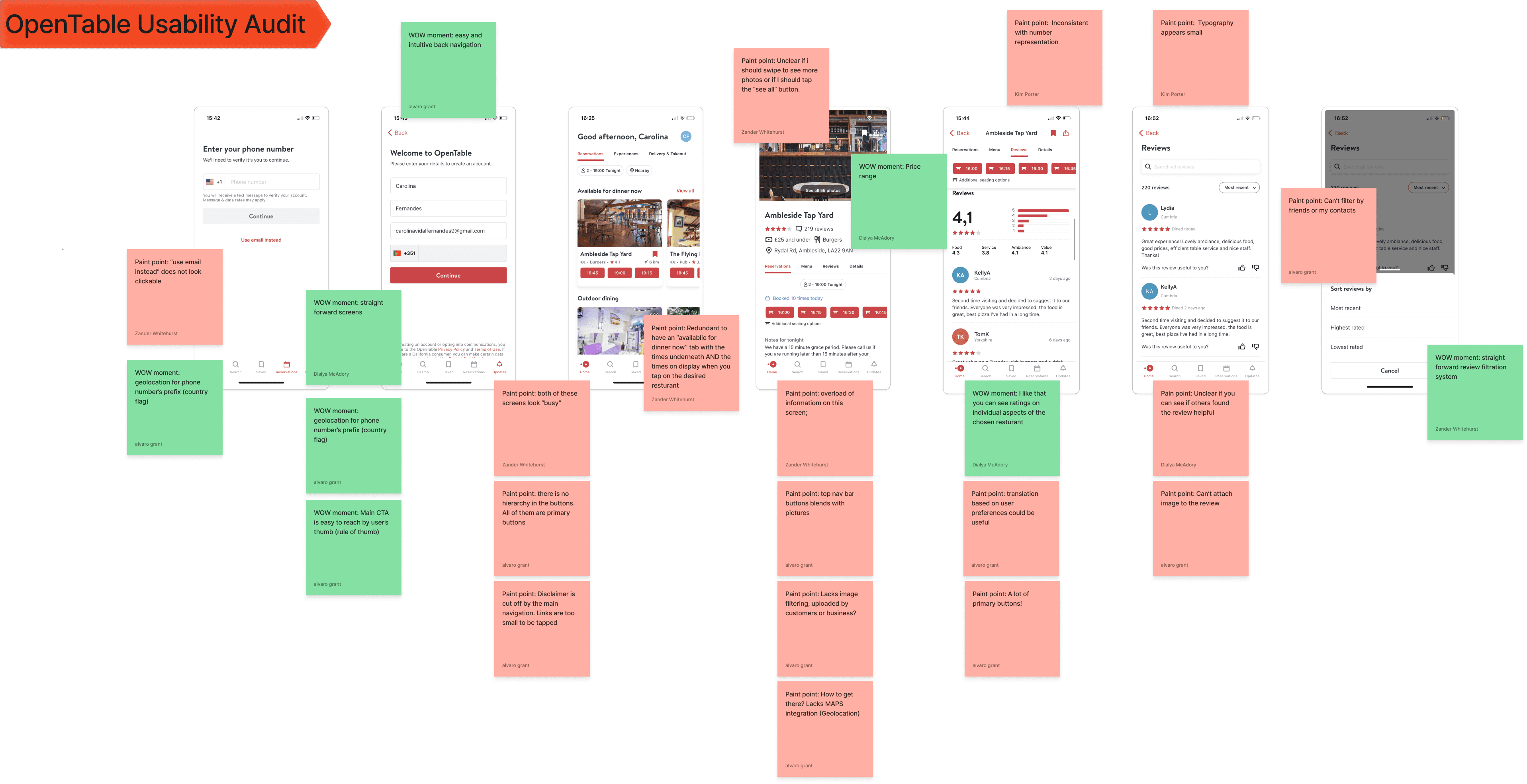
In order to understand what usability issues users may be experiencing we conducted a usability audit, focusing on pinpointing any heuristic violations. It is imperative for me to ask myself, “what do I love about this site/app” and “what is painful to see?"

Next, we decided to take a look at the competitors of OpenTable by conducting a SWOT analysis, studying their experimental design choices and analyzing their user flows. From this, we were able to gain insight into the world of our competition and identify areas that could enhance the user’s overall experience.
Throughout our team deliberations, a recurring observation emerged: an absence of features allowing users to connect and engage with each other. This insight presented the unexplored territory of a food loving community. By addressing this gap, we could, not only enhance user interaction, but also cultivate a vibrant community and ultimately foster a loyalty within OpenTable.


Ideation

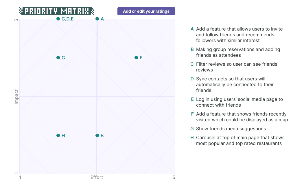
After a quick Crazy 8’s session to rapidly spark ideas, the team took some time to build on their concepts. Once these ideas blossomed, we gathered the best of the ideas and plotted them on a priority matrix to see if the effort into these ideas were impactful enough to positively enhance the user’s journey.
The UI
Wireframing
Following our ideation session, we started to map out our low fidelity designs and concepts. In order to focus on integration with the existing app’s components, we used these lo-fi wireframes to blueprint the layout.

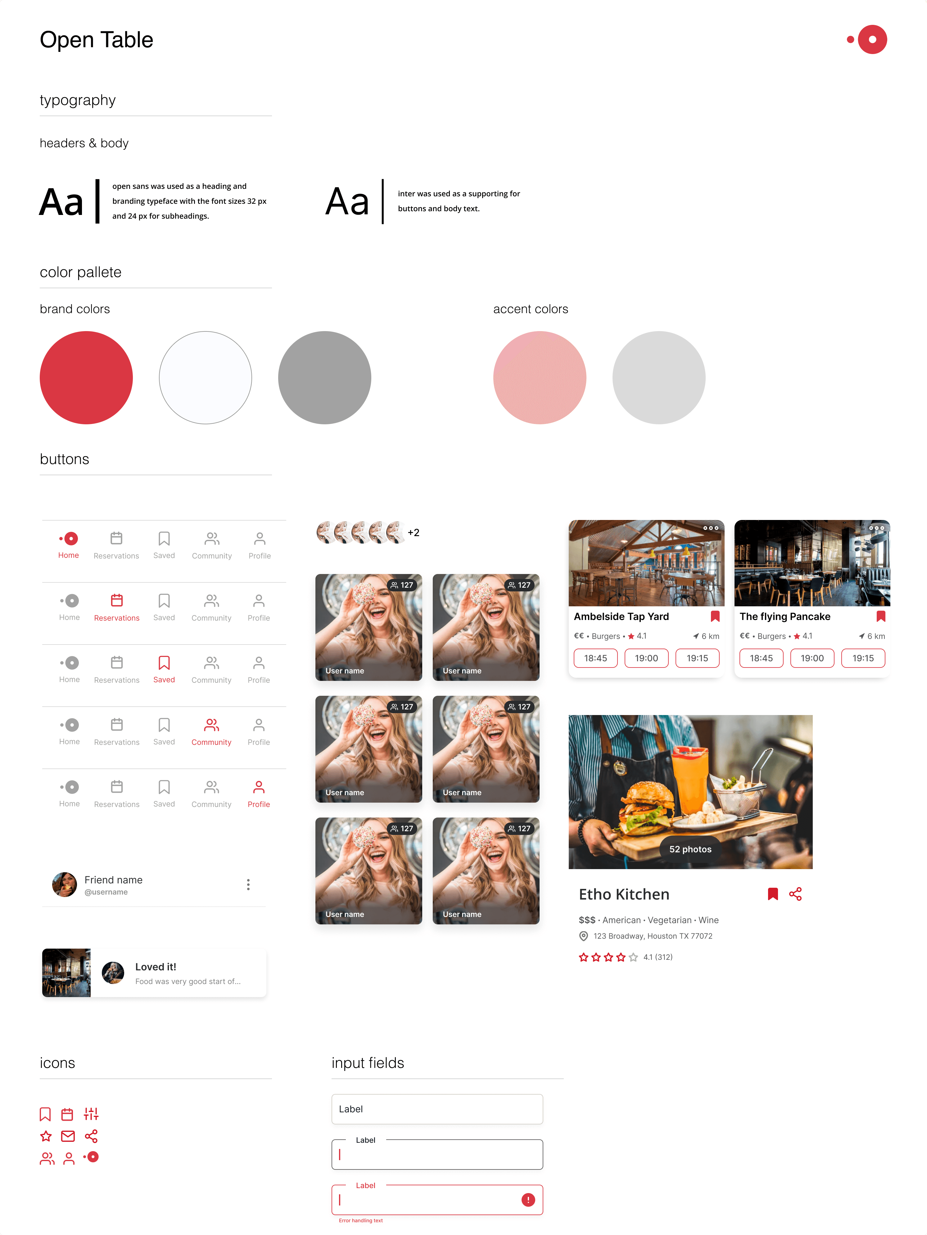
UI Kit and Visual Design
We developed hi-fi mockups incorporating OpenTable’s design system while infusing new components into the mix such as profile avatars, activity feeds, and icons.


Framer 2023
Memphis